Black and white is not a filter. It is a decision to remove colour so that shape, contrast and tone do the work alone, and it either improves an image or exposes that there was never much in it to begin with.
The captions and quotes below are for anyone posting monochrome work, writing about it, or trying to explain to a client why a grey photograph is not a mistake. Most of the lines are short captions written for this piece; a smaller group are well-known quotations about photography and monochrome, attributed to the photographers they are commonly attributed to.
Short Captions
- No colour, no hiding.
- Grey is not a compromise.
- Light, minus the distraction.
- Tones and lines and nothing else.
- Monochrome Monday, again.
- The world with the volume turned down.
- What is left when colour leaves.
- Shooting in black and white on purpose.
- Contrast is a language.
- Shadow doing the talking.
- Silver tones, digital sensor.
- Black and white is a decision, not a filter.
- Quietly loud.
- Greyscale, greyscale, greyscale.
- Only the shapes survived the edit.
- Tone study number four hundred.
- Chromatic noise removed.
- Less information, more argument.
- Dark meets light meets dark.
- The same street, one stop darker.
Moody and Quiet
- Low light, low noise, high contrast.
- Grey on grey on grey.
- Some days look better in monochrome.
- Cloud cover and contrast.
- Evening, uncoloured.
- Fog does the composition for you.
- A long exposure and a long walk.
- Night, quietly documented.
- Mist, and everything it hides.
- Dim light and a steadier hand.
- The gloomiest frame of the day.
- Rain, and monochrome agreeing with each other.
- Windows, wet, greyscale.
- Sixty seconds of stillness.
- Shadow without a colour temperature.
- Overcast light, silver print.
- After the sun left.
- Winter seems designed for this.
- Beautiful weather for a grey photograph.
- The lamp was the only source.
Minimal and Graphic
- Two lines and a shadow.
- Negative space and one figure.
- Reduce until something remains.
- A wall, a shadow and nothing else.
- Geometry, undressed.
- Composition with no colour argument.
- Diagonals, mono.
- One subject, one shadow, one frame.
- Clean lines, dirty pavement.
- The shape was the whole point.
- Stripped back to structure.
- Simplest possible version of this view.
- Repetition, rhythm, greyscale.
- High key, low contrast.
- Blown highlights, deliberate.
- Crushed blacks, deliberate.
- Texture and nothing to distract from it.
- Abstract, no context.
- Pattern study.
- Concrete, glass, grey.
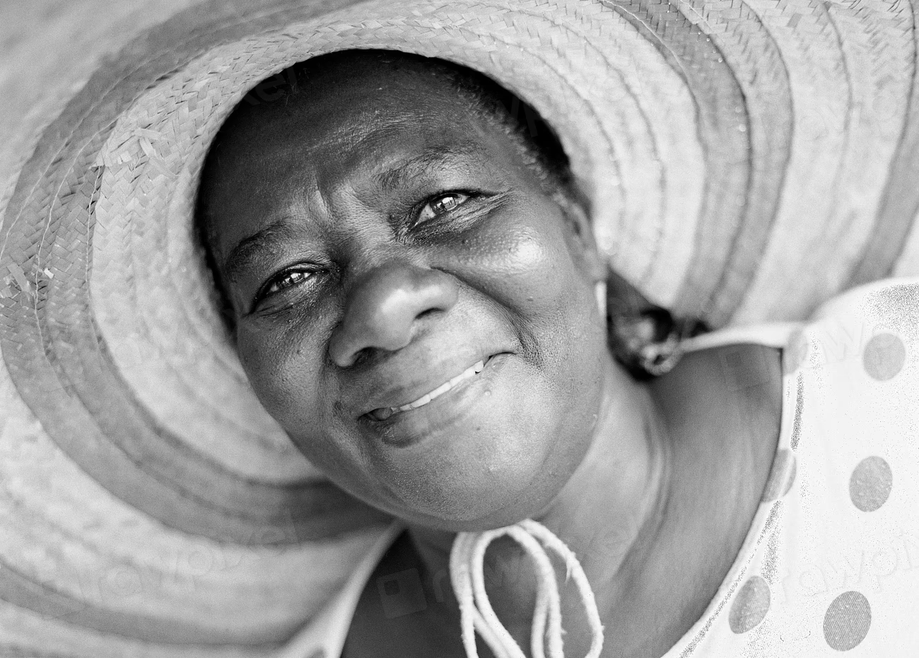
For Portraits
- A face, in greyscale, still a face.
- Skin tones without the colour question.
- Eyes first, always.
- One side lit, one side not.
- Portrait, minus colour's opinion.
- Wrinkles look honest in black and white.
- The light does the flattering.
- Shadow across the cheek.
- Monochrome suits people.
- Studio portrait, single source.
- Eyes down, no colour, no context.
- Timeless, not dated.
- Everybody looks like themselves in grey.
- Half-lit and entirely themselves.
- Soft light, hard look.
- Window light and one expression.
- A portrait that has not aged badly.
- Black and white keeps the emphasis where it belongs.
For Street and Documentary
- Street work suits monochrome.
- Anonymous city, in grey.
- Moments the colour would have ruined.
- Photographing the ordinary on purpose.
- One second, one frame, one colour: none.
- The city as a set of shapes.
- Candid, greyscale, unplanned.
- Documentary, unvarnished.
- Everyone is a stranger in the frame.
- Monochrome is the honest option when the light is bad.
- Reported in black and white.
- Two hundred shots, one keeper.
- A photograph of a moment that will not repeat.
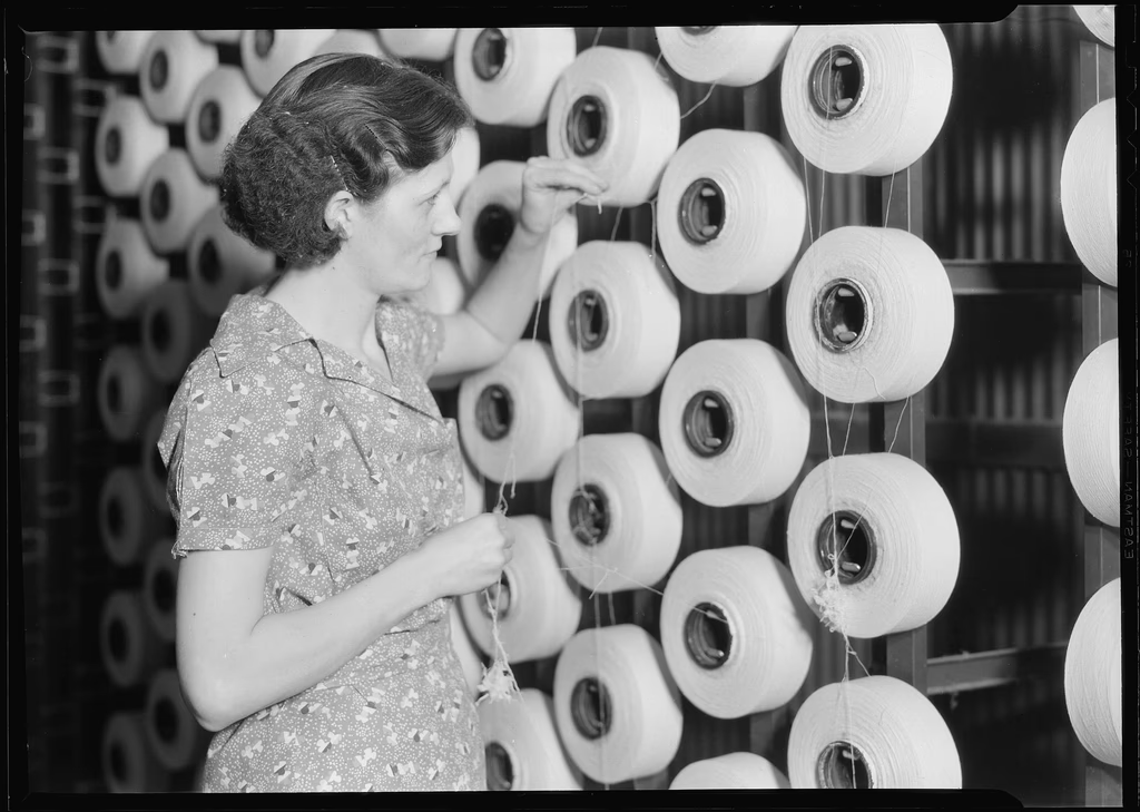
For Architecture and Lines
- Concrete and steel, no colour needed.
- Facades and angles.
- Structure, lit from one side.
- Buildings do not need colour to be interesting.
Quotes Worth Keeping
- "You don't take a photograph, you make it." — Ansel Adams
- "There are no rules for good photographs, there are only good photographs." — Ansel Adams
Two more that do not fit the numbered list but belong with them:
"Photography takes an instant out of time, altering life by holding it still." — Dorothea Lange
"A photograph is a secret about a secret." — Diane Arbus
Why Black and White Still Works
Colour carries information, and information competes. Remove it and the viewer's attention goes straight to structure: how the light falls, where the dark shapes sit, and whether the frame holds together without help.
That is also why monochrome is unforgiving. A weak colour photograph can survive on a beautiful palette. A weak black-and-white photograph has nothing left to hide behind, and it becomes obvious within a second that there was no composition there.
The other reason it persists is historical depth. A century of documentary and portrait work trained audiences to read grey images as serious, which is a bias rather than a truth, and it is still a useful one if you want a photograph to be taken seriously.
Converting Without Just Desaturating
Pulling the saturation slider to zero produces the flat, dull result that gives black and white a bad name. Colour channels are the whole technique: they control how two colours of similar brightness separate in tone.
A red filter darkens blue skies dramatically and turns skin lighter. An orange or yellow filter softens that effect. A green filter lightens foliage and darkens skin, which is often used in landscape work for exactly that reason.
The practical workflow is straightforward. Shoot in colour unless you are sure you want monochrome, since you can always convert later and cannot recover colour you never recorded. Then, in editing, convert with a channel mixer or the equivalent control, and adjust the individual luminance sliders rather than working on overall contrast alone. Lift shadows rather than raising exposure, and stop before the curve turns into a caricature of contrast. A repeatable, disciplined approach to conversion, applying the same few controls in a fixed order, is worth more than any preset.
Raw files matter here as well, because a JPEG has already compressed the tonal data you are about to stretch. A black-and-white photograph made from a compressed JPEG will band and posterise in gradients, and sky areas are where it shows first.
Tips for Better Monochrome Work
- Shoot in colour and convert later, so you keep the option.
- Think about contrast before you press the shutter. Monochrome needs bold tonal separation in the scene itself.
- Use colour channel filters to control how tones separate, not just overall contrast.
- Expose for the highlights. Blown skies in monochrome cannot be recovered, and grey mud is worse than a dark sky.
- Check the histogram, not your eyes. Grey-looking files are often correctly exposed.
- Accept that many colour photographs fail in black and white. That is information about the photograph, not the conversion.
- Give a grey image something graphic: a line, a shape, a strong shadow. Colour is no longer available to carry the frame.
Conclusion
Black and white is a formal decision with a clear purpose: it forces a photograph to justify itself with structure, light and moment rather than palette. Used that way it makes ordinary scenes look deliberate and weak scenes look weak, which is why so many documentary photographers have depended on it.
For anyone posting monochrome work, the honest test is simple. Look at your frame and ask what is carrying it now that colour is gone. If the answer is the light, the shape, or the moment, the conversion has done its job. If the answer is nothing, the original photograph was the problem.
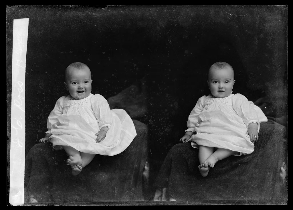
If you are building a monochrome set, the two things that repay attention are the conversion itself and the archive you are drawing on. A careful, repeatable edit is what separates a deliberate grey photograph from a desaturated one, and looking closely at historic monochrome work is the fastest way to learn what a frame can carry, which is a habit that starts with really looking at an image rather than glancing at it.
FAQ
Is black and white photography still relevant?
Yes, particularly in documentary, fine art and portrait work. Removing colour forces a photograph to stand on structure and light, and audiences have read monochrome as serious for a century, which is a bias that still works in your favour.
Should I shoot in black and white mode or convert later?
Shoot in colour and convert later. Monochrome capture modes throw away colour data permanently, and you cannot change the tonal separation afterwards. A raw file gives you the most control in conversion.
How do I make a good black-and-white conversion?
Use colour channel controls rather than just desaturating. Adjust individual channel luminance to control how similar tones separate, expose for the highlights, lift shadows rather than raising overall exposure, and keep the contrast curve restrained.
Why does my black-and-white photography look flat?
Usually two reasons: the scene had no tonal separation to begin with, or desaturation was used instead of a proper channel-based conversion. A grey image also needs graphic content, since colour is no longer there to hold the viewer's attention.
Which colours become which grey tones?
Red becomes dark grey, with the exact result depending on the channel mix. Orange and yellow darken slowly. Green tends towards mid-grey, and blue tends dark. In landscape work this is why a red filter darkens a sky so dramatically.
What should I look for in a scene for black and white?
Strong tonal contrast, clear shapes, and directional light producing distinct shadow. Look for separation between the subject and the background in brightness rather than in hue, because that distinction is what survives the conversion.